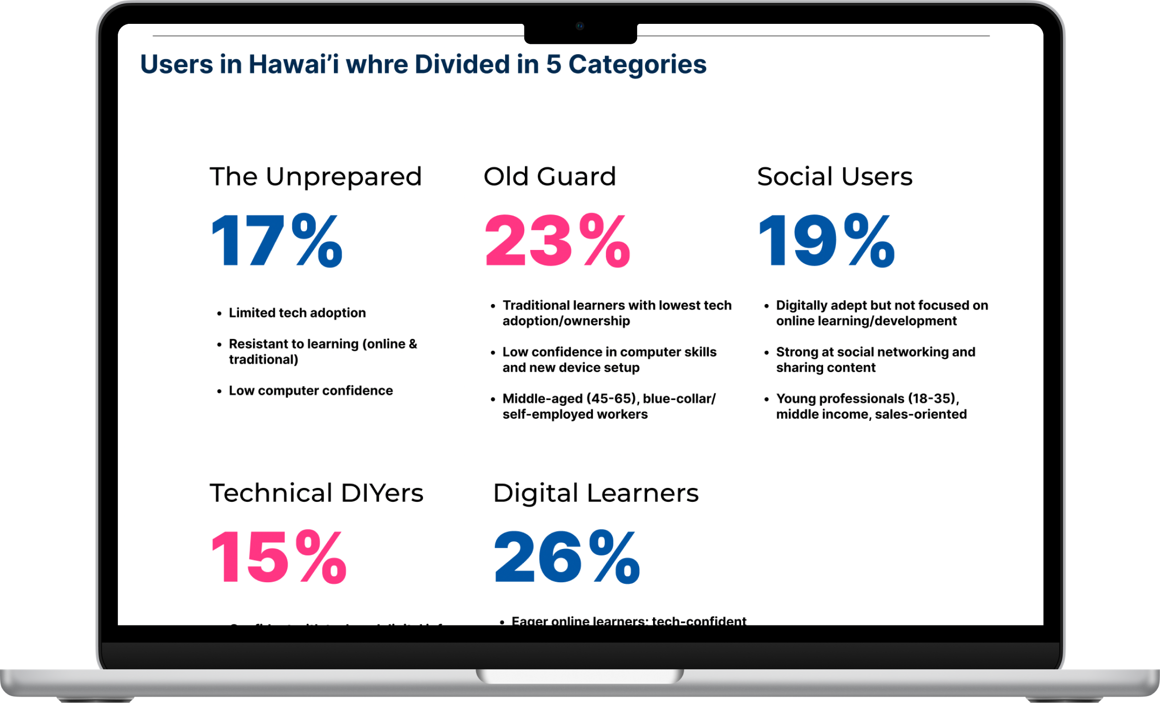
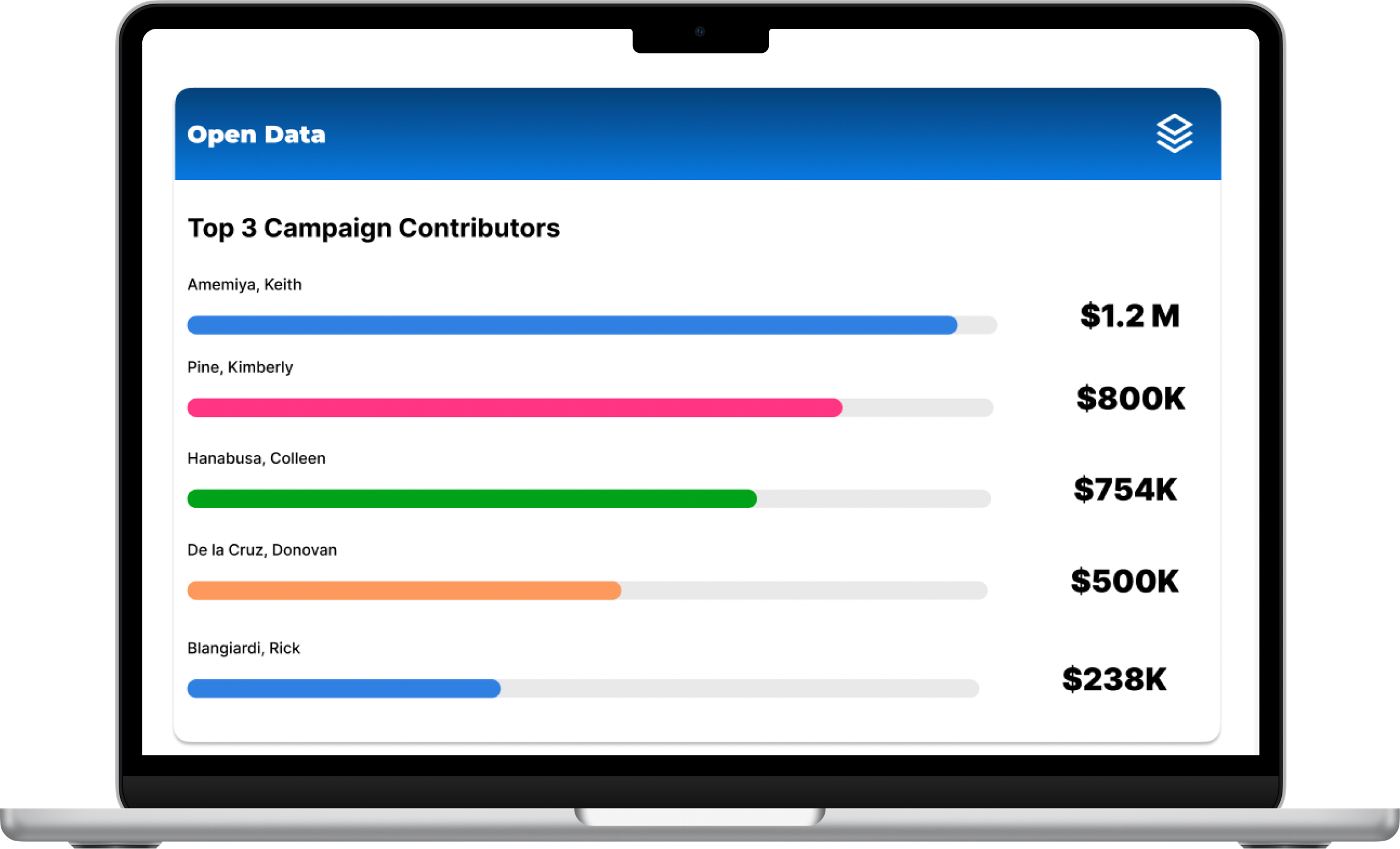
Hawai’i Digital Equity Dashboard
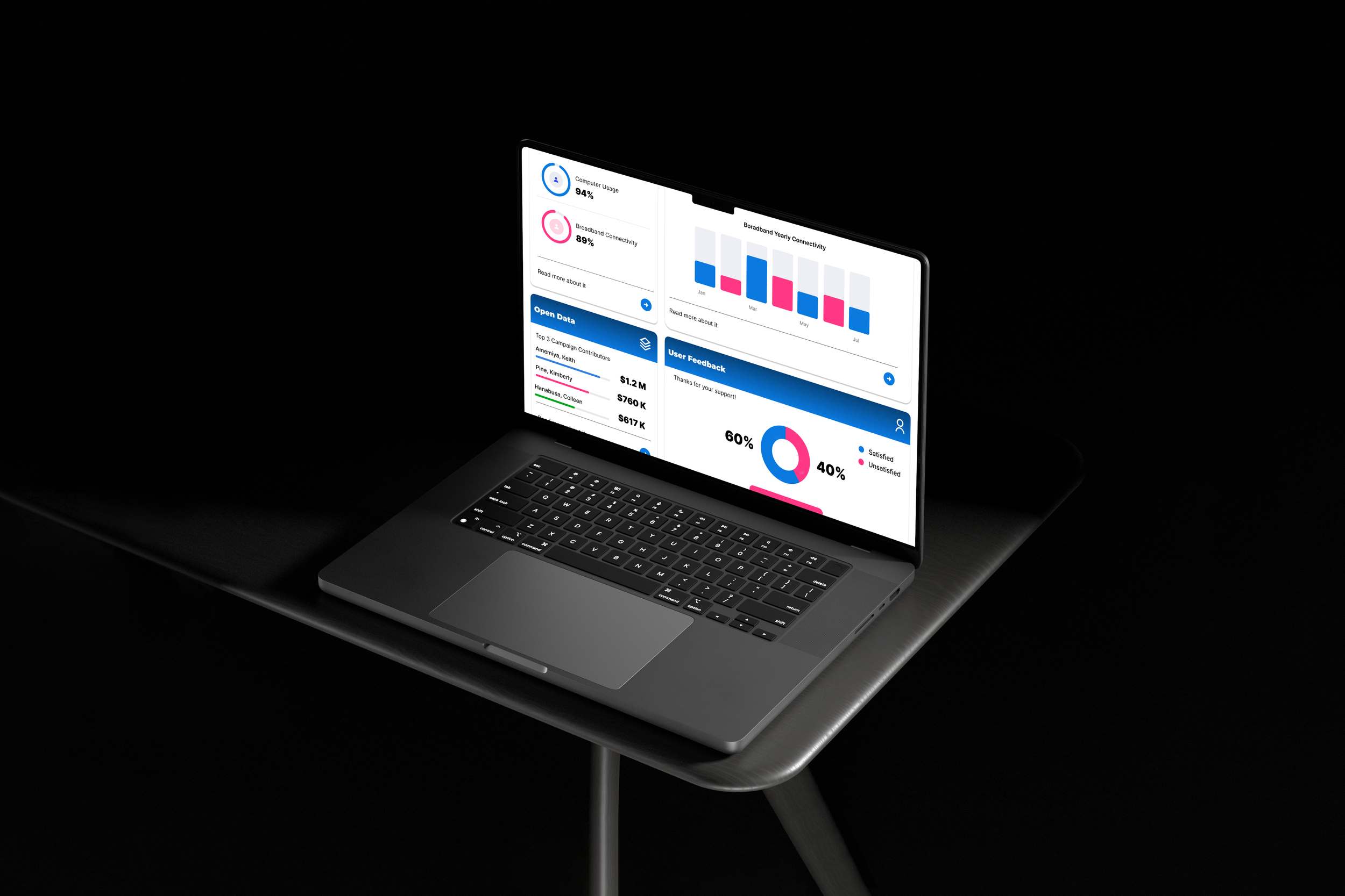
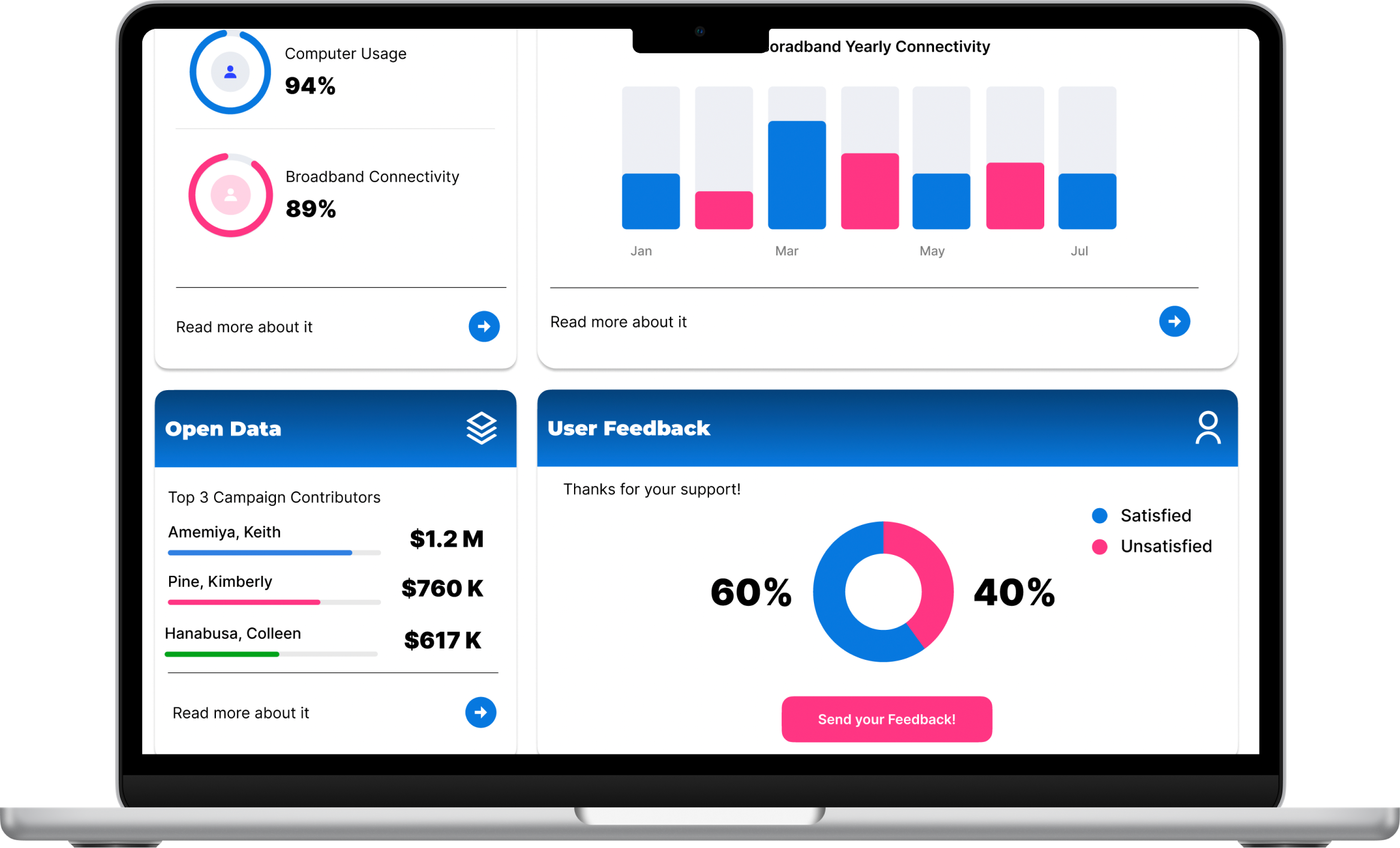
Designed the initial dashboard prototype for Hawaii's Digital Equity Program, a new state-wide initiative.
This experience showed me how powerful design can be in helping people understand and act on important data, which is exactly what we need for climate action – when people clearly see the impact of climate change, they're more likely to take action.
My Role
As a UX/UI Designer I led end-to-end design process, taking the dashboard from initial through final UI design.
Problem to Solve
Hawaii’s Digital Equity Program faces a challenge in effectively presenting complex data from the Digital Equity Map to policymakers, educators, and community members. The lack of a clear, user-friendly platform makes it difficult for stakeholders to understand and act on the data to close the digital equity gap.
Our Goal
Our goal is to design a digital equity dashboard that prioritizes user-centered design, ensuring the data is accessible, visually clear, and easy to navigate, enabling informed decision-making to address digital equity across the state.
We knew that to help bridge Hawaii’s digital equity gap, we needed a solution that anyone—policymakers, educators, community members—could understand and use.

A platform where anyone can get a clear view of Hawaii’s digital equity landscape in seconds.
Our Vision
Intuitive Plattform
Designed for ease of use, making digital equity data accessible to all.
Open Source
Accessible, allowing anyone to contribute to and benefit from the platform.
User Centered
Provides a quick snapshot of Hawaii's digital equity status at a glance.
The Solution
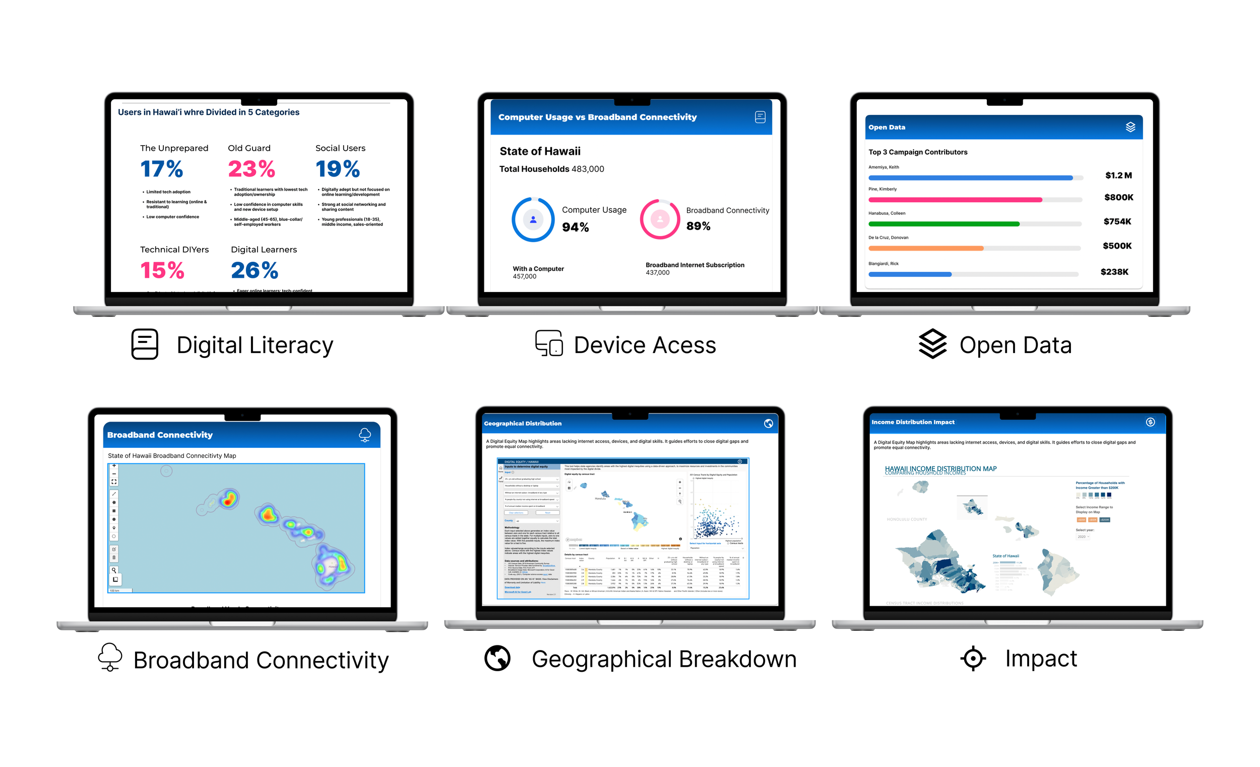
The Digital Equity Dashboard presents critical data points like digital literacy, device access, and broadband connectivity—all in one place.
Designed to be accessible, user-friendly, and visually impactful.
Key Indicators
The dashboard incorporates six key indicators that provide crucial insights into Hawaii's current digital equity landscape.
A Design that Reflects Hawaii’s Spirit
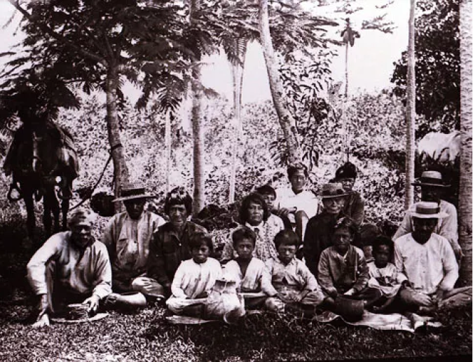
Now, let’s talk about the design. We wanted the dashboard to feel local, to reflect the beauty and spirit of Hawaii while maintaining the readability and professionalism this project demands.
Color Palette
Our color palette? Inspired by Hawaii’s ocean blues and hibiscus pinks—warm, welcoming, and, most importantly, authentic. We aimed for simplicity and clarity, a design as clear as Hawaii’s water, that helps users find what they need without distractions.

